How NOT to Take a Profile Picture for your Private Practice Website
The Most Common Mistakes and How to Avoid them
You may already have a website or consider setting one up for your professional private practice.
Perhaps you are keen on including your profile photograph or still have some doubts. You might think…
“I am not photogenic.”
“I am a professional and it is my service that matters, not my appearance.”
“I don't want to put myself out there where everyone can see me.”
These are some of the responses we often hear from counsellors and therapists. We have previously written about the importance of a profile photo and why it matters for your practice so check out Marks blog to find out more.
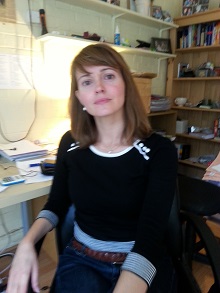
It is hard to see what is right with this picture: it is fuzzy, the background is cluttered,
the lighting is overdone, the head is tilted backwards creating an air of arrogance.
This is definitely how NOT to take a picture for your professional website!
First impressions matter
First impressions matter and research has shown that even the most enlightened and inclusive individuals still form impressions based on pictures. Characteristics will automatically be attributed and, although they are often revised once a person gets to know the other, you are unlikely to have this opportunity with people visiting your website.
People who look for counselling or therapy want to know if you could be the one they want to share their personal issues with. Will you offer the warmth, professionalism, skill and support they are after? These attributes can be reflected in the right picture. So think about the messages you want to convey and what could visually support them.
We know many therapists and counsellors who decide to put their profile photo on their practice website but don't wish to invest in a professional shoot. Others quite happily rise to the challenge of taking their own picture. If done well, a picture taken in your practice surroundings can reiterate your message of being a competent, approachable professional, someone who is trustworthy and able to help.
However, over the years we have seen many photos that should not have seen the showroom that is a website. Here we have a collection of common mistakes and how to avoid them.
The wrong environment
Don't use pictures taken in pubs, on holidays with a cocktail in your hand, on your sofa or in your kitchen. Briefly, any environment that shows you at leisure and belongs to your personal life. Separate the two. Saying that, there may be the odd exception and you may have a good photo that you have taken on holidays - fully clothed, well-lit, against the backdrop of blue horizons - that may be absolutely fantastic and well-suited as a profile picture for your website. If you think this is the case, read on to see if it meets the other criteria of a good profile picture.
Preferrably, you have your picture taken in your office where you would usually hold therapy sessions with clients, outside in good daylight or/ and in front of a plain background.
Fuzzy pictures
There are different degrees of fuzziness and, whilst a picture may not appear blurred, it may lack in crispness and clarity. Unfortunately, many amateur cameras provide only mediocre or poor results for pictures taken indoors (even when the flash is on) so, if your camera isn't great, we recommend that you take pictures outdoors in natural daylight. Always use the best camera available to you.

Example of a picture that lacks crispness
Too much or too little light/ Light in all the wrong places
Depending on the position of the sun (when pictures are taken outside) or the availability and position of light sources indoors, the results can vary widely and, in the worst case, lead to a distortion of your face. There can be too much light, too little light or light cast on the wrong parts of the picture.
Take the time to plan the lighting. Choose a spot that sees plenty of natural daylight, but is not necessarily in full sun. A bright, yet overcast day often offers the best conditions for a good photo.
When inside, be aware of the shadows cast on your face and adjust the lighting or your standing/ seating position accordingly.

The nose becomes the most prominent feature in this picture where too much light
is shed on the protruding bits whilst the rest of my face shrinks back into a twilight.
Pictures taken from below the face
This often happens with selfies and sometimes with webcam pictures. Make sure the camera is at your height so you don’t look up or down.

Looking down on the client? Some might think so, but
in the best-case scenario, it's just perceived as unprofessional and overly casual.
Inappropriate clothing
Again, keep your personal life separate from your professional life. Evening dress and revealing summer tops are a no-no and so are multiple layers of winter clothes.
It is best to have your picture taken in clothes in which you would like to be seen by your clients. Ask yourself what you wear in therapy or counselling sessions with clients. What do you feel most comfortable in? How do you want clients to see you? Remember that the choice of clothing sends messages to clients about your personality and approachability.

Nice autumn walk? Yes! Good profile picture? No!
It looks like this picture was chosen at random from a personal photo collection.
Facial expression and eye contact with the camera
This is an important one. The photo on your website is an anchor point that helps potential clients to form an initial impression about your qualities, your competence and your ability to connect with them.
Not making eye contact with the camera is a bad idea and in most cases may be seen as a diminished ability to connect with your client. You might be the warmest and most approachable therapist or counsellor there is, however, if this is not shown in the picture, potential clients may not have the chance to find this out and may not contact you as a result.
We also recommend that you show a genuine smile. If this is difficult for you in front of the camera, try to imagine being in a session with a client, listening to his story and the progress he has made since the last session. Perhaps this will put a thoughtful smile on your face.
So don’t miss a chance to create a good initial impression and a look that tells the client that you are trustworthy and easy to talk to.

A missed chance to suggest to clients that I can connect with them. The facial expression
is too serious and website visitors might be forgiven to think that I don’t actually like people much.
Objects that don't belong - cluttered background
When taking a picture, pay attention to the background. Make sure that the background is plain or related to what you do. For example, an armchair may be appropriate as it can be used in sessions. Bookshelves can also be appropriate as they may emphasise your skills and knowledge as a professional. However, be choosy and pay attention to other items that might clutter the background and draw attention from an otherwise lovely picture.
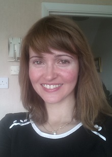
Various items clutter the background and spoil an otherwise decent, well-lit picture.
Conclusions
As said elsewhere, we would always recommend you invest in a professional photograph. If you choose to go it on your own, pay attention to the areas highlighted above as they will make a big difference about that important first impression that potential clients will gain of you.
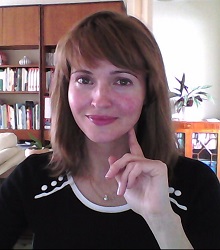
Nadine Seiler is an Independent Social Work Consultant, Trainer & Author. She provides advice and consultancy for YouCan Consulting.
 Sidebar Menu
